Streamlit
Dashboards
As part of my personal exploration with Python beyond coursework, I built and deployed two Streamlit web apps — each solving a real, distinct problem. Both are publicly accessible, version-controlled on GitHub, and live on the web.
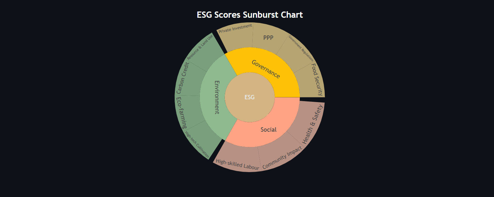
ESG Sunburst Visualisation App
Built as a freelance-style task to make abstract ESG (Environmental, Social, Governance) frameworks digestible for non-technical stakeholders. The centrepiece is an interactive sunburst chart — a chart type I deliberately sought out to learn. Users can upload their own data, build a hierarchy node-by-node, undo steps, filter by ESG category, and export the result as an image — all without writing code.
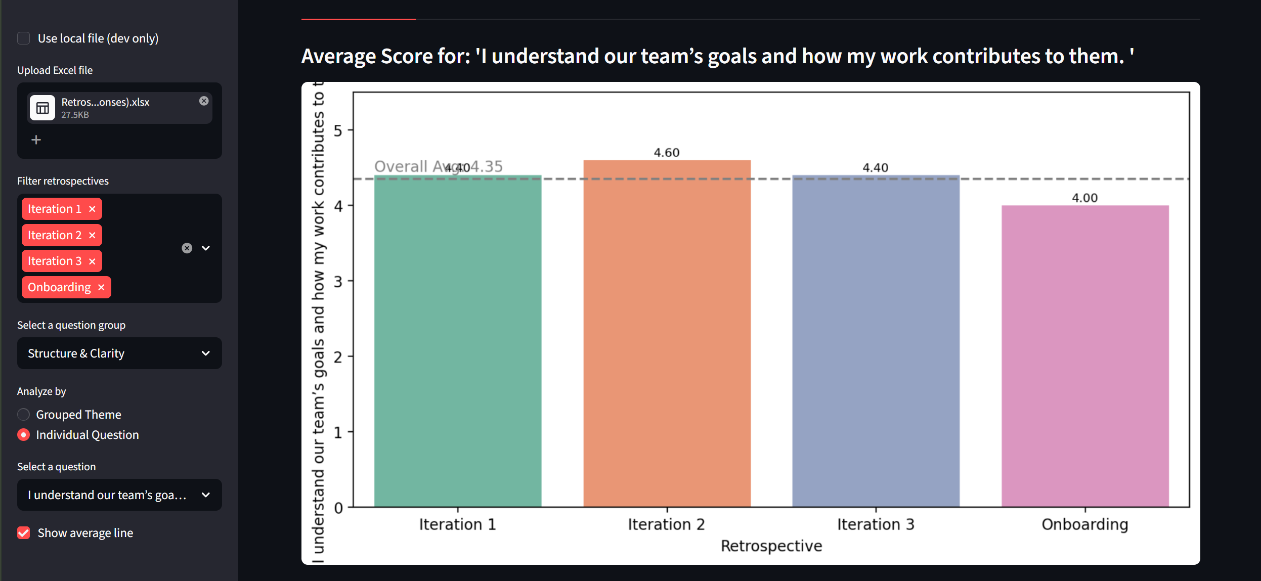
Team Retrospective Dashboard
During the FIT5120 group project at Monash, I noticed coordination gaps within the team. Rather than leaving it unaddressed, I proposed and led a solution: designing a retrospective survey, collecting responses from teammates, and building a dynamic Streamlit dashboard to visualise how collaboration health evolved across sprint iterations — turning subjective feelings into something actionable and visible.
Why Streamlit?
Both projects were deliberate choices to build something end-to-end in Python. Streamlit is free, Python-native with no context-switching to JavaScript, and deploying a live web app takes a single command. Each project also let me practise the full pipeline at once — data wrangling, visualisation, Git version control, and shipping a real accessible URL — which is what data work looks like outside the classroom.